# Liquid Glass in Practice: .glassEffect() in iOS 26
Table of Contents
When iOS 26 shipped Liquid Glass, I was in the middle of working on Readeck, my open-source reader app, and I wanted to adopt it right away. That is the quiet upside of an open-source side project: no client, no brand guide, nobody to sign it off, so I get to pull in a brand new design language the week it drops, just because I feel like it. So I did, but gently, only in the few spots where glass earns its place, the clearest being the two floating buttons that appear once you have almost finished an article.
Liquid Glass is Apple’s new translucent material.
It is not just a blur.
It bends and picks up what is behind it, so a control floating over text, images and code reads as a separate layer without going fully opaque.
In SwiftUI you get it from a single modifier: .glassEffect().
Why I wanted glass in the first placeLink to heading
Most of my day job is cross-platform work, which means Material Design almost everywhere I look, so Liquid Glass felt like fresh air. My hunch, and it is only a hunch, is that Apple built it partly to pull away from the cross-platform crowd and show off what the chips can actually do.
Readeck already had a fairly plasticky look, so I wanted to work some glass in, but gently, not turn every surface into a bubble. I started with the tab bar, which gives the nicest effect and the most headaches. My main reference was Apple’s Podcasts app: I find most of Apple’s own apps a little boring, but Podcasts nails the behavior, especially the way the tab bar collapses as you scroll so the content takes over. That is the whole point in a reader, and good glass should get out of the content’s way.
The basics: one modifierLink to heading
Start as small as it gets. Take any view, add one modifier, and it becomes a piece of Liquid Glass:
Image(systemName: "star.fill") .frame(width: 52, height: 52) .glassEffect()That is the whole API for the simple case.
Two things to know before you wonder why nothing happened.
It only renders on iOS 26, so on anything older the modifier quietly does nothing.
And if it does nothing on iOS 26 too, check your Info.plist for UIDesignRequiresCompatibility: that key opts your app out of the new design system, and if it ever slipped in you can lose an hour wondering where your glass went.
Grouping glass: GlassEffectContainerLink to heading
My two floating buttons appear once you pass about 90 percent of an article, straight off the reading progress I already track. Here they are, Favorite (the star) and Archive, floating over the tail end of an article:
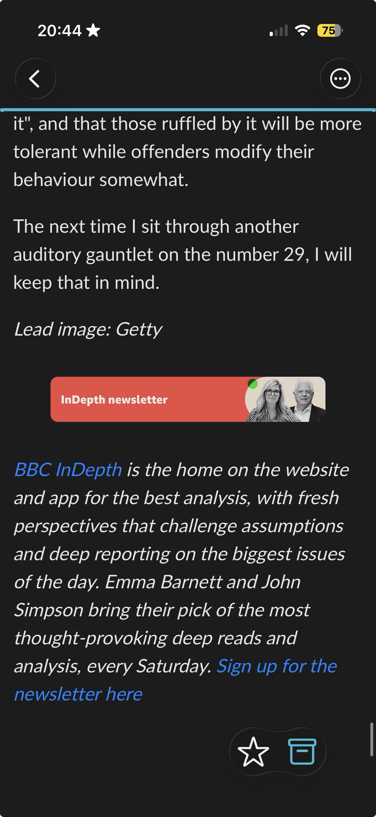
I want them to read as one piece of glass, so I wrap them in a GlassEffectContainer and put .glassEffect() on each button:
GlassEffectContainer(spacing: 52) {    HStack(spacing: 52) {        Button { viewModel.toggleFavorite() } label: {            Image(systemName: "star.fill").frame(width: 52, height: 52)        }        .glassEffect()
        Button { viewModel.toggleArchive() } label: {            Image(systemName: "archivebox").frame(width: 52, height: 52)        }        .glassEffect()    }}
The modifier goes on each button, not the container.
The container is what lets the two shapes blend at the edges instead of fighting when they sit close together.
And I never scatter if #available through this layout, because the whole reader view is @available(iOS 26.0, *) behind a tiny router, so older devices never reach it.
That is really all there is to it, which is the nice part.
The hard call with glass is where it goes, not how you write it.
Where glass earns its keep, and where it does notLink to heading
Glass is tempting to overuse, and it punishes that fast. The wins are narrow and specific.
It works on floating, interactive elements that sit over dynamic content: these two buttons hovering over text and images are the textbook case. It falls apart on static toolbars with a solid background, where it just adds noise. It flickers on list rows as they scroll. It fights legibility under small text labels, where the blur competes with the thing you are trying to read.
My rule of thumb ended up simple. Glass only on floating controls over a moving background, and never more than one or two glass surfaces on a screen. If you cannot say why a surface is glass, it should not be.
Glass that lives in the WebViewLink to heading
There is one spot the native modifier cannot reach. When you select text to highlight it, the little annotation toolbar lives inside the WebView’s DOM, not in SwiftUI. That is this toolbar, the copy and search actions with the highlight colors underneath, sitting on glass right over the article:
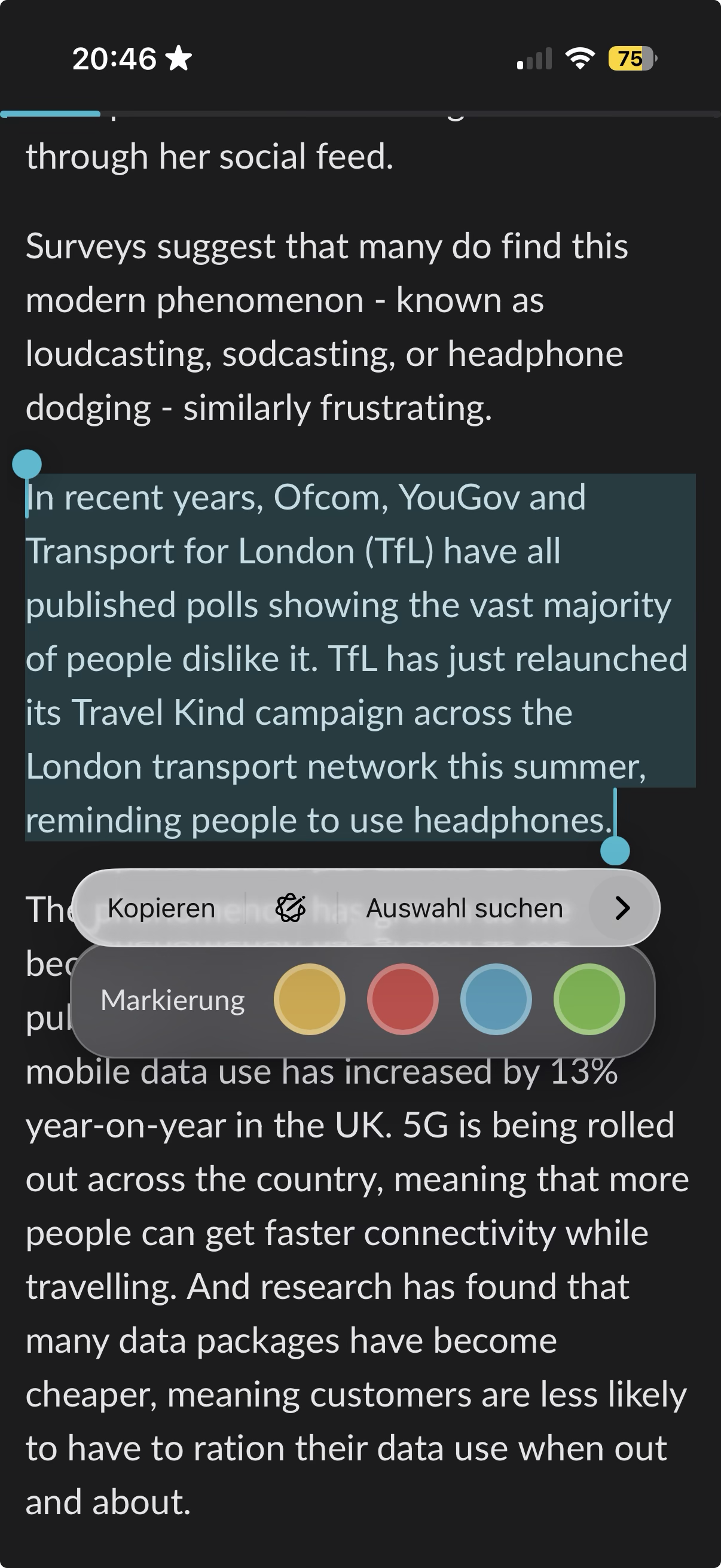
.glassEffect() has no idea that layer exists, so I rebuilt the same look in CSS with backdrop-filter:
background: rgba(255, 255, 255, 0.15);backdrop-filter: blur(20px) saturate(180%);-webkit-backdrop-filter: blur(20px) saturate(180%);border: 1px solid rgba(255, 255, 255, 0.2);border-radius: 24px;box-shadow: 0 8px 32px rgba(0, 0, 0, 0.3), 0 2px 8px rgba(0, 0, 0, 0.15), inset 0 1px 0 rgba(255, 255, 255, 0.3);The saturate(180%) is what sells it.
A plain blur looks grey and dead, while pushing saturation lets the color behind the glass bleed through, which is most of what makes Apple’s version feel alive.
The little triangle pointing at the selected text gets the exact same treatment: a 20 by 20 square rotated 45 degrees with the same background and blur, so the pointer reads as one piece of glass with the toolbar.
It is not pixel-identical to native .glassEffect(), and it does not need to be.
The point is that a highlight toolbar in the WebView and a floating button in SwiftUI feel like the same material, even though one is Swift and the other is CSS.
This is the part you cannot skip if you want the product to feel finished. The moment you have a WebView in the mix, and I did, the glass has to carry into it too, or the seam between native and web gives the whole thing away. Rebuilding it in CSS instead of one clean modifier was a bit annoying. But that is the difference between mostly consistent and actually round, and rounding off that last bit is the whole job.
The takeawayLink to heading
Liquid Glass is a tool, not a paint bucket.
On the native side it is one modifier, .glassEffect(), and the real work is deciding the two places it belongs.
Inside the WebView, backdrop-filter: blur(20px) saturate(180%) gets you close enough that the seam disappears.
Everywhere else, the best use of glass is not using it.